Template instructions
Template instructions
This is a generic template.
Page specific instructions:
General instructions:
- Replace the name of the business with a logo if it exists
- Replace all images. They are placeholders.
- Add descriptive alt text to all images
- Optimize your images for fast page load using the indications on the PDF
- Images need to be named properly (short description) before uploading to content library
- In order to help with spacing and alignment, some css was used. Below is an explanation of what styling was used and what you can modify.
#dm .dmBody .dmRespRow {
padding-top: 70px;
padding-bottom: 70px;
}
Sets a default top and bottom row padding of 70px
.middle {
display: -webkit-box;
display: -moz-box;
display: -ms-flexbox;
display: -webkit-flex;
display: flex;
flex-direction: column;
justify-content: center;
align-items: center;
}
Class added to a column to center elements vertically.
In this template the class 'middle' is added to the navigation and the phone number columns in the header.
#dm h1, #dm h1 *, #dm div.dmContent h1 {
border: 0 !important;
font-weight: 400;
margin-bottom: 0 !important;
margin-top: 0 !important;
padding-bottom: 0 !important;
padding-top: 0 !important;
text-transform: uppercase;
}
Sets basic styling for the Large Title:
- a normal (400) font weight
- no unnecessary margins, paddings and borders
- makes it all caps
#dm h2 {
margin-bottom: 15px !important;
margin-top: 0 !important;
padding-bottom: 0 !important;
padding-top: 0 !important;
text-transform: uppercase;
}
Sets basic styling for the h2 (This is not the Small Title element. You can use an h2 by dragging a Small Title and choosing h2 from the drop down.)
.dark-row .dmNewParagraph{
color:#fff;
}
Class added to a row / column in which you want the text to be white.
Home
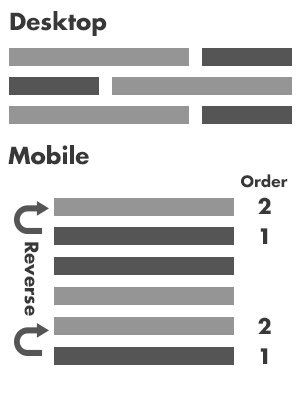
Reverse column's order on mobile if you place the image on both left and right.
ADD the CSS below to site-mobile.css
.reverseRow .dmRespCol, .reverseMidRow .dmRespCol {
min-height: 150px !important;
}
.reverseRow .dmRespColsWrapper .dmRespCol:first-child { order: 2;
}
.reverseRow .dmRespColsWrapper .dmRespCol:last-child {
order: 1;
}
Please remember to add "reverseRow" as class name to the row which you wanna arrange the order on mobile.
QA
Be very detailed on your QA and follow the checklist.
Optimize your images for fast page load using the indications on the PDF.